2A.ML101.3: Supervised Learning: Classification of Handwritten Digits#
Links: notebook, html, python, slides, GitHub
In this section we’ll apply scikit-learn to the classification of handwritten digits. This will go a bit beyond the iris classification we saw before: we’ll discuss some of the metrics which can be used in evaluating the effectiveness of a classification model.
Source: Course on machine learning with scikit-learn by Gaël Varoquaux
from sklearn.datasets import load_digits
digits = load_digits()
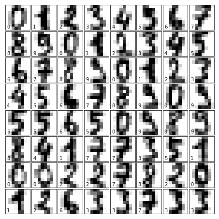
We’ll re-use some of our code from before to visualize the data and remind us what we’re looking at:
%matplotlib inline
from matplotlib import pyplot as plt
fig = plt.figure(figsize=(6, 6))  # figure size in inches
fig.subplots_adjust(left=0, right=1, bottom=0, top=1, hspace=0.05, wspace=0.05)

# plot the digits: each image is 8x8 pixels
for i in range(64):
    ax = fig.add_subplot(8, 8, i + 1, xticks=[], yticks=[])
    ax.imshow(digits.images[i], cmap=plt.cm.binary, interpolation='nearest')

    # label the image with the target value
    ax.text(0, 7, str(digits.target[i]))
Visualizing the Data#
A good first-step for many problems is to visualize the data using a Dimensionality Reduction technique. We’ll start with the most straightforward one, Principal Component Analysis (PCA).
PCA seeks orthogonal linear combinations of the features which show the
greatest variance, and as such, can help give you a good idea of the
structure of the data set. Here we’ll use RandomizedPCA, because
it’s faster for large N.
from sklearn.decomposition import PCA
pca = PCA(n_components=2, svd_solver="randomized")
proj = pca.fit_transform(digits.data)
plt.scatter(proj[:, 0], proj[:, 1], c=digits.target)
plt.colorbar();
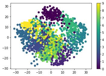
Question: Given these projections of the data, which numbers do you think a classifier might have trouble distinguishing?
Gaussian Naive Bayes Classification#
For most classification problems, it’s nice to have a simple, fast, go-to method to provide a quick baseline classification. If the simple and fast method is sufficient, then we don’t have to waste CPU cycles on more complex models. If not, we can use the results of the simple method to give us clues about our data.
One good method to keep in mind is Gaussian Naive Bayes. It fits a Gaussian distribution to each training label independantly on each feature, and uses this to quickly give a rough classification. It is generally not sufficiently accurate for real-world data, but can perform surprisingly well, for instance on text data.
from sklearn.naive_bayes import GaussianNB
from sklearn.model_selection import train_test_split
# split the data into training and validation sets
X_train, X_test, y_train, y_test = train_test_split(digits.data, digits.target)

# train the model
clf = GaussianNB()
clf.fit(X_train, y_train)

# use the model to predict the labels of the test data
predicted = clf.predict(X_test)
expected = y_test
Question: why did we split the data into training and validation sets?
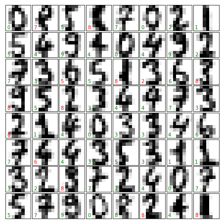
Let’s plot the digits again with the predicted labels to get an idea of how well the classification is working:
fig = plt.figure(figsize=(6, 6))  # figure size in inches
fig.subplots_adjust(left=0, right=1, bottom=0, top=1, hspace=0.05, wspace=0.05)

# plot the digits: each image is 8x8 pixels
for i in range(64):
    ax = fig.add_subplot(8, 8, i + 1, xticks=[], yticks=[])
    ax.imshow(X_test.reshape(-1, 8, 8)[i], cmap=plt.cm.binary,
              interpolation='nearest')

    # label the image with the target value
    if predicted[i] == expected[i]:
        ax.text(0, 7, str(predicted[i]), color='green')
    else:
        ax.text(0, 7, str(predicted[i]), color='red')
Quantitative Measurement of Performance#
We’d like to measure the performance of our estimator without having to resort to plotting examples. A simple method might be to simply compare the number of matches:
matches = (predicted == expected)
print(matches.sum())
print(len(matches))
364
450
matches.sum() / float(len(matches))
0.8088888888888889
We see that nearly 1500 of the 1800 predictions match the input. But
there are other more sophisticated metrics that can be used to judge the
performance of a classifier: several are available in the
sklearn.metrics submodule.
One of the most useful metrics is the classification_report, which
combines several measures and prints a table with the results:
from sklearn import metrics
from pandas import DataFrame
DataFrame(metrics.classification_report(expected, predicted, output_dict=True)).T
| f1-score | precision | recall | support | |
|---|---|---|---|---|
| 0 | 0.987013 | 0.974359 | 1.000000 | 38.0 |
| 1 | 0.584615 | 0.826087 | 0.452381 | 42.0 |
| 2 | 0.734177 | 0.906250 | 0.617021 | 47.0 |
| 3 | 0.851852 | 0.920000 | 0.793103 | 58.0 |
| 4 | 0.880952 | 0.925000 | 0.840909 | 44.0 |
| 5 | 0.949495 | 0.940000 | 0.959184 | 49.0 |
| 6 | 0.952381 | 0.961538 | 0.943396 | 53.0 |
| 7 | 0.894118 | 0.863636 | 0.926829 | 41.0 |
| 8 | 0.549296 | 0.393939 | 0.906977 | 43.0 |
| 9 | 0.750000 | 1.000000 | 0.600000 | 35.0 |
| micro avg | 0.808889 | 0.808889 | 0.808889 | 450.0 |
| macro avg | 0.813390 | 0.871081 | 0.803980 | 450.0 |
| weighted avg | 0.818369 | 0.872767 | 0.808889 | 450.0 |
Another enlightening metric for this sort of multi-label classification is a confusion matrix: it helps us visualize which labels are being interchanged in the classification errors:
DataFrame(metrics.confusion_matrix(expected, predicted))
| 0 | 1 | 2 | 3 | 4 | 5 | 6 | 7 | 8 | 9 | |
|---|---|---|---|---|---|---|---|---|---|---|
| 0 | 38 | 0 | 0 | 0 | 0 | 0 | 0 | 0 | 0 | 0 |
| 1 | 0 | 19 | 0 | 0 | 0 | 0 | 0 | 0 | 23 | 0 |
| 2 | 0 | 2 | 29 | 0 | 0 | 0 | 0 | 0 | 16 | 0 |
| 3 | 0 | 0 | 2 | 46 | 0 | 1 | 0 | 1 | 8 | 0 |
| 4 | 1 | 0 | 0 | 0 | 37 | 0 | 1 | 1 | 4 | 0 |
| 5 | 0 | 0 | 0 | 1 | 0 | 47 | 1 | 0 | 0 | 0 |
| 6 | 0 | 0 | 0 | 0 | 1 | 1 | 50 | 0 | 1 | 0 |
| 7 | 0 | 0 | 0 | 0 | 1 | 1 | 0 | 38 | 1 | 0 |
| 8 | 0 | 2 | 1 | 0 | 0 | 0 | 0 | 1 | 39 | 0 |
| 9 | 0 | 0 | 0 | 3 | 1 | 0 | 0 | 3 | 7 | 21 |
We see here that in particular, the numbers 1, 2, 3, and 9 are often being labeled 8.