2A.ml - Machine Learning et Marketting - correction#
Links: notebook, html, python, slides, GitHub
Classification binaire, correction.
%matplotlib inline
Populating the interactive namespace from numpy and matplotlib
import matplotlib.pyplot as plt
from jyquickhelper import add_notebook_menu
add_notebook_menu()
Données#
Tout d’abord, on récupère la base de données : Bank Marketing Data Set.
url = "https://archive.ics.uci.edu/ml/machine-learning-databases/00222/"
file = "bank.zip"
import pyensae.datasource
data = pyensae.datasource.download_data(file, website=url)
import pandas
df = pandas.read_csv("bank.csv",sep=";")
df.tail()
| age | job | marital | education | default | balance | housing | loan | contact | day | month | duration | campaign | pdays | previous | poutcome | y | |
|---|---|---|---|---|---|---|---|---|---|---|---|---|---|---|---|---|---|
| 4516 | 33 | services | married | secondary | no | -333 | yes | no | cellular | 30 | jul | 329 | 5 | -1 | 0 | unknown | no |
| 4517 | 57 | self-employed | married | tertiary | yes | -3313 | yes | yes | unknown | 9 | may | 153 | 1 | -1 | 0 | unknown | no |
| 4518 | 57 | technician | married | secondary | no | 295 | no | no | cellular | 19 | aug | 151 | 11 | -1 | 0 | unknown | no |
| 4519 | 28 | blue-collar | married | secondary | no | 1137 | no | no | cellular | 6 | feb | 129 | 4 | 211 | 3 | other | no |
| 4520 | 44 | entrepreneur | single | tertiary | no | 1136 | yes | yes | cellular | 3 | apr | 345 | 2 | 249 | 7 | other | no |
Exercice 1 : prédire y en fonction des attributs#
Les données ne sont pas toutes au format numérique, il faut convertir les variables catégorielles. Pour cela, on utilise la fonction DictVectorizer.
import numpy
import numpy as np
numerique = [ c for c,d in zip(df.columns,df.dtypes) if d == numpy.int64 ]
categories = [ c for c in df.columns if c not in numerique and c not in ["y"] ]
target = "y"
print(numerique)
print(categories)
print(target)
num = df[ numerique ]
cat = df[ categories ]
tar = df[ target ]
['age', 'balance', 'day', 'duration', 'campaign', 'pdays', 'previous']
['job', 'marital', 'education', 'default', 'housing', 'loan', 'contact', 'month', 'poutcome']
y
On traite les variables catégorielles :
from sklearn.feature_extraction import DictVectorizer
prep = DictVectorizer()
cat_as_dicts = [dict(r.iteritems()) for _, r in cat.iterrows()]
temp = prep.fit_transform(cat_as_dicts)
cat_exp = temp.toarray()
prep.feature_names_
['contact=cellular',
 'contact=telephone',
 'contact=unknown',
 'default=no',
 'default=yes',
 'education=primary',
 'education=secondary',
 'education=tertiary',
 'education=unknown',
 'housing=no',
 'housing=yes',
 'job=admin.',
 'job=blue-collar',
 'job=entrepreneur',
 'job=housemaid',
 'job=management',
 'job=retired',
 'job=self-employed',
 'job=services',
 'job=student',
 'job=technician',
 'job=unemployed',
 'job=unknown',
 'loan=no',
 'loan=yes',
 'marital=divorced',
 'marital=married',
 'marital=single',
 'month=apr',
 'month=aug',
 'month=dec',
 'month=feb',
 'month=jan',
 'month=jul',
 'month=jun',
 'month=mar',
 'month=may',
 'month=nov',
 'month=oct',
 'month=sep',
 'poutcome=failure',
 'poutcome=other',
 'poutcome=success',
 'poutcome=unknown']
On construit les deux matrices  = (features, classe).
Remarque : certains modèles d’apprentissage n’acceptent pas les
corrélations. Lorsqu’on crée des variables catégorielles à choix unique,
les sommes des colonnes associées à une catégories fait nécessairement
un. Avec deux variables catégorielles, on introduit nécessairement des
corrélations. On pense à enlever les dernières catégories :
'contact=unknown', 'default=yes', 'education=unknown',
'housing=yes',
'job=unknown', 'loan=yes', 'marital=single', 'month=sep',
'poutcome=unknown'.
cat_exp_df = pandas.DataFrame( cat_exp, columns = prep.feature_names_ )
reject = ['contact=unknown', 'default=yes', 'education=unknown', 'housing=yes','job=unknown',
          'loan=yes', 'marital=single', 'month=sep', 'poutcome=unknown']
keep = [ c for c in cat_exp_df.columns if c not in reject ]
cat_exp_df_nocor = cat_exp_df [ keep ]
X = pandas.concat ( [ num, cat_exp_df_nocor ], axis= 1)
Y = tar.apply( lambda r : (1.0 if r == "yes" else 0.0))
X.shape, Y.shape
((4521, 42), (4521,))
Quelques corrélations sont très grandes malgré tout :
import numpy
numpy.corrcoef(X)
array([[ 1.        ,  0.99733687,  0.96756321, ...,  0.89646012,
         0.9809934 ,  0.94772372],
       [ 0.99733687,  1.        ,  0.98202501, ...,  0.8917544 ,
         0.99153146,  0.96013301],
       [ 0.96756321,  0.98202501,  1.        , ...,  0.90132068,
         0.998155  ,  0.98697606],
       ...,
       [ 0.89646012,  0.8917544 ,  0.90132068, ...,  1.        ,
         0.90491984,  0.94963638],
       [ 0.9809934 ,  0.99153146,  0.998155  , ...,  0.90491984,
         1.        ,  0.98331872],
       [ 0.94772372,  0.96013301,  0.98697606, ...,  0.94963638,
         0.98331872,  1.        ]])
On divise en base d’apprentissage et de test :
from sklearn.model_selection import train_test_split
X_train, X_test, Y_train, Y_test = train_test_split(X, Y, test_size=0.33)
Puis on cale un modèle d’apprentissage :
from sklearn.ensemble import GradientBoostingClassifier, RandomForestClassifier
type_classifier = GradientBoostingClassifier
clf = type_classifier()
clf = clf.fit(X_train, Y_train.ravel())
La méthode
ravel
évite de prendre en compte l’index de Y_train. La méthode
train_test_split
conserve dans l’index les positions initiales des élèments. Mais l’index
fait que Y_train[0] ne désigne pas le premier élément de Y_train
mais le premier élément du tableau initial. Y_train.ravel()[0]
désigne bien le premier élément du tableau. On calcule ensuite la
matrice de confusion (Confusion
matrix)
:
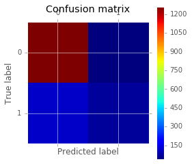
from sklearn.metrics import confusion_matrix
for x,y in [ (X_train, Y_train), (X_test, Y_test) ]:
    yp  = clf.predict(x)
    cm = confusion_matrix(y.ravel(), yp.ravel())
    print(cm)

import matplotlib.pyplot as plt
plt.matshow(cm)
plt.title('Confusion matrix')
plt.colorbar()
plt.ylabel('True label')
plt.xlabel('Predicted label')
[[2685   14]
 [ 161  169]]
[[1261   40]
 [ 120   71]]
<matplotlib.text.Text at 0x294ed68>
Si le model choisi est un GradientBoostingClassifier, on peut regarder l’importance des variables dans la construction du résultat. Le graphe suivant est inspiré de la page Gradient Boosting regression même si ce n’est pas une régression qui a été utilisée ici.
import numpy as np
feature_name = X.columns

limit = 20
feature_importance = clf.feature_importances_[:20]
feature_importance = 100.0 * (feature_importance / feature_importance.max())
sorted_idx = np.argsort(feature_importance)
pos = np.arange(sorted_idx.shape[0]) + .5
plt.subplot(1, 2, 2)
plt.barh(pos, feature_importance[sorted_idx], align='center')
plt.yticks(pos, feature_name[sorted_idx])
plt.xlabel('Relative Importance')
plt.title('Variable Importance')
<matplotlib.text.Text at 0x149d5a90>
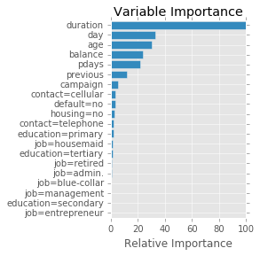
Il faut tout de même rester prudent quant à l’interprétation du graphe précédent. La documentation au sujet de limportance des features précise plus ou moins comment sont calculés ces chiffres. Toutefois, lorsque des variables sont très corrélées, elles sont plus ou moins interchangeables. Tout dépend alors comment l’algorithme d’apprentissage choisit telle ou telle variables, toujours dans le même ordre ou dans un ordre aléatoire.
variables#
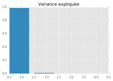
On utilise le code de la séance 3 Analyse en Composantes Principales pour observer les variables.
from sklearn.decomposition import PCA
pca = PCA(n_components=4)
x_transpose = X.T
pca.fit(x_transpose)
PCA(copy=True, n_components=4, whiten=False)
plt.bar(numpy.arange(len(pca.explained_variance_ratio_))+0.5, pca.explained_variance_ratio_)
plt.title("Variance expliquée")
<matplotlib.text.Text at 0x161b9630>
import warnings
warnings.filterwarnings('ignore')
X_reduced = pca.transform(x_transpose)
plt.figure(figsize=(18,6))
plt.scatter(X_reduced[:, 0], X_reduced[:, 1])
for label, x, y in zip(x_transpose.index, X_reduced[:, 0], X_reduced[:, 1]):
    plt.annotate(
        label,
        xy = (x, y), xytext = (-10, 10),
        textcoords = 'offset points', ha = 'right', va = 'bottom',
        bbox = dict(boxstyle = 'round,pad=0.5', fc = 'yellow', alpha = 0.5),
        arrowprops = dict(arrowstyle = '->', connectionstyle = 'arc3,rad=0'))
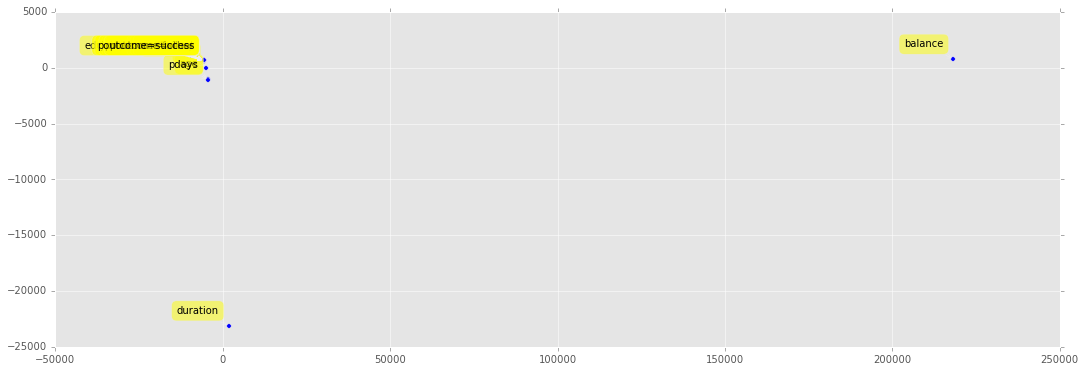
Les variables les plus dissemblables sont celles qui contribuent le plus. Toutefois, à la vue de ce graphique, il apparaît qu’il faut normaliser les données avant d’interpréter l’ACP :
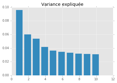
from sklearn.preprocessing import normalize
xnorm = normalize(x_transpose)
pca = PCA(n_components=10)
pca.fit(xnorm)
plt.bar(numpy.arange(len(pca.explained_variance_ratio_))+0.5, pca.explained_variance_ratio_)
plt.title("Variance expliquée")
<matplotlib.text.Text at 0x1628bd68>
X_reduced = pca.transform(xnorm)
plt.figure(figsize=(18,6))
plt.scatter(X_reduced[:, 0], X_reduced[:, 1])
for label, x, y in zip(x_transpose.index, X_reduced[:, 0], X_reduced[:, 1]):
    plt.annotate(
        label,
        xy = (x, y), xytext = (-10, 10),
        textcoords = 'offset points', ha = 'right', va = 'bottom',
        bbox = dict(boxstyle = 'round,pad=0.5', fc = 'yellow', alpha = 0.5),
        arrowprops = dict(arrowstyle = '->', connectionstyle = 'arc3,rad=0'))
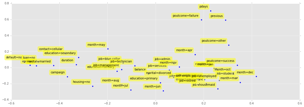
Nettement mieux. En règle générale, il est préférable de normaliser ses données avant d’apprendre un modèle. Cela n’est pas toujours nécessaire (comme pour les arbres de décision). Toutefois, numériquement, avoir des données d’ordre de grandeur très différent introduit toujours plus d’approximations.
from sklearn.pipeline import Pipeline
from sklearn.preprocessing import Normalizer
from sklearn.ensemble import GradientBoostingClassifier

clf = Pipeline([
      ('normalize', Normalizer()),
      ('classification', GradientBoostingClassifier())
    ])
clf = clf.fit(X_train, Y_train.ravel())
from sklearn.metrics import confusion_matrix
x,y = X_test, Y_test
yp  = clf.predict(x)
cm2 = confusion_matrix(y, yp)
print("non normalisé\n",cm)
print("normalisé\n",cm2)
non normalisé
 [[1261   40]
 [ 120   71]]
normalisé
 [[1270   31]
 [ 127   64]]
C’est plus ou moins équivalent lorsque les variables sont normalisées dans ce cas. Il faudrait vérifier sur la courbe ROC.
Exercice 2 : tracer la courbe ROC#
On utilise l’exemple Receiver Operating Characteristic (ROC) qu’il faut modifié car la réponse juste dans notre cas est le fait de prédire la bonne classe. Cela veut dire qu’il y a deux cas pour lesquels le modèle prédit le bon résultat : on choisit la classe qui la probabilité la plus forte.
from sklearn.metrics import roc_curve, auc
probas = clf.predict_proba(X_test)
probas[:5]
array([[ 0.9792842 ,  0.0207158 ],
       [ 0.98228488,  0.01771512],
       [ 0.83708208,  0.16291792],
       [ 0.98675536,  0.01324464],
       [ 0.98818146,  0.01181854]])
On construit le vecteur des bonnes réponses :
rep = [ ]
yt = Y_test.ravel()
for i in range(probas.shape[0]):
    p0,p1 = probas[i,:]
    exp = yt[i]
    if p0 > p1 :
        if exp == 0 :
            # bonne réponse
            rep.append ( (1, p0) )
        else :
            # mauvaise réponse
            rep.append( (0,p0) )
    else :
        if exp == 0 :
            # mauvaise réponse
            rep.append ( (0, p1) )
        else :
            # bonne réponse
            rep.append( (1,p1) )
mat_rep = numpy.array(rep)
mat_rep[:5]
array([[ 1.        ,  0.9792842 ],
       [ 1.        ,  0.98228488],
       [ 1.        ,  0.83708208],
       [ 1.        ,  0.98675536],
       [ 1.        ,  0.98818146]])
"taux de bonne réponse",sum(mat_rep[:,0]/len(mat_rep)) # voir matrice de confusion
('taux de bonne réponse', 0.89410187667560337)
fpr, tpr, thresholds = roc_curve(mat_rep[:,0], mat_rep[:, 1])
roc_auc = auc(fpr, tpr)
plt.plot(fpr, tpr, label='ROC curve (area = %0.2f)' % roc_auc)
plt.plot([0, 1], [0, 1], 'k--')
plt.xlim([0.0, 1.0])
plt.ylim([0.0, 1.0])
plt.xlabel('False Positive Rate')
plt.ylabel('True Positive Rate')
plt.title('ROC')
plt.legend(loc="lower right")
<matplotlib.legend.Legend at 0x17e0df60>
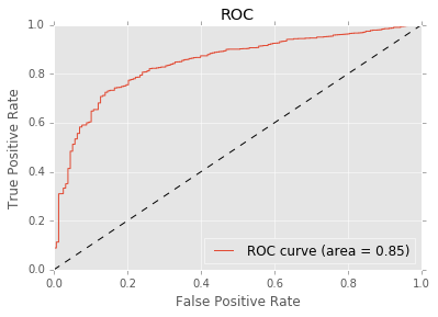
Ce score n’est pas si mal pour un premier essai. On n’a pas tenu compte du fait que la classe 1 est sous-représentée (voir Quelques astuces pour faire du machine learning. A priori, ce ne devrait pas être le cas du GradientBoostingClassifier. C’est une famille de modèles qui, lors de l’apprentissage, pondère davantage les exemples où ils font des erreurs. L’algorithme de boosting le plus connu est AdaBoost.
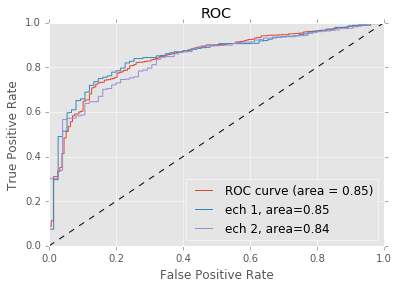
On tire maintenant deux échantillons aléatoires qu’on ajoute au graphique précédent :
import random
Y1 = numpy.array([ random.randint(0,1) == 0 for i in range(0,mat_rep.shape[0]) ])
Y2 = numpy.array([ random.randint(0,1) == 0 for i in range(0,mat_rep.shape[0]) ])

fpr1, tpr1, thresholds1 = roc_curve(mat_rep[Y1,0], mat_rep[Y1, 1])
roc_auc1 = auc(fpr1, tpr1)
fpr2, tpr2, thresholds2 = roc_curve(mat_rep[Y2,0], mat_rep[Y2, 1])
roc_auc2 = auc(fpr2, tpr2)
print(fpr1.shape,tpr1.shape,fpr2.shape,tpr2.shape)

import matplotlib.pyplot as plt
fig = plt.figure()
ax = fig.add_subplot(1,1,1)

ax.plot(fpr, tpr, label='ROC curve (area = %0.2f)' % roc_auc)
ax.plot([0, 1,2], [0, 1,2], 'k--')
ax.set_xlim([0.0, 1.0])
ax.set_ylim([0.0, 1.0])
ax.set_xlabel('False Positive Rate')
ax.set_ylabel('True Positive Rate')
ax.set_title('ROC')
ax.plot(fpr1, tpr1, label='ech 1, area=%0.2f' % roc_auc1)
ax.plot(fpr2, tpr2, label='ech 2, area=%0.2f' % roc_auc2)
ax.legend(loc="lower right")
(697,) (697,) (699,) (699,)
<matplotlib.legend.Legend at 0x17e82940>