|
d3.js, d3py, ensae, ipython, nvd3, python, python-nvd3, r, shiny, vincent
|
2013-11-30 More about interactive graphs using Python, d3.js, R, shiny, IPython, vincent, d3py, python-nvd3
I recently found this url The Big List of D3.js Examples. As d3.js is getting popular - their website is pretty nice -, I was curious if I could easily use it through Python. After a couple of searches (many in fact), I discovered vincent and some others. It ended up doing a quick review. Every script was tested with Python 3.
Contents:
- Graphs with IPython and QtConsole
- Graphs with IPython Notebook
- Graph with d3.js and IPython Notebook
- Graphs with Python and vincent
- Graphs with Python and d3py
- Graphs with IPython and nvd3
- R with shiny
- Alternatives
- How will you share the graph? (no share, image, web + HTML and Javascript, web + R)
- Can you see the graph you want to do in galleries?
Use of IPython (qt)console
The QtConsole looks like a command line window but is able to display images inline using matplotlib:
You can enable it by using the following steps:
- Install pyqt (only once, Windows users can go there)
- Go to <Python folder>/Scripts and type ipython3 qtconsole
- In the console, type %matplotlib inline
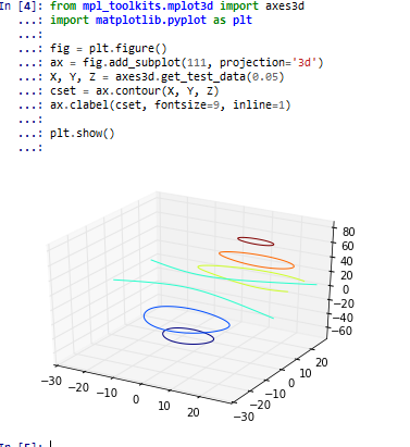
%load http://matplotlib.org/plot_directive/mpl_examples/mplot3d/contour3d_demo.py
Use of IPython notebook
The Notebook still looks like the same as the QtConsole but with some changes:
- You can save a workspace (and retrieve your past sessions).
- You can replay a command inline instead of running it again below (for example after you import a missing module).
- You can inline HTML and Javascript inline (and images too). This feature is very interesting if your program produces web pages.
- It works through a browser.
It requires some installation first. A couple of modules are needed but it is rather well explained (except you need to replace jinja by jinja2 for Python 3). Other than that, it works well too:
- Go to <Python folder>/Scripts and type ipython3 notebook mynotebook.ipynb
from IPython.display import YouTubeVideo
YouTubeVideo('1j_HxD4iLn8')
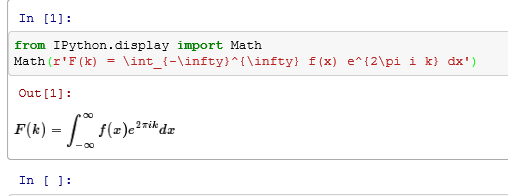
And press Shift + Enter to run it. I like the following too:
from IPython.display import Math
Math(r'F(k) = \int_{-\infty}^{\infty} f(x) e^{2\pi i k} dx')
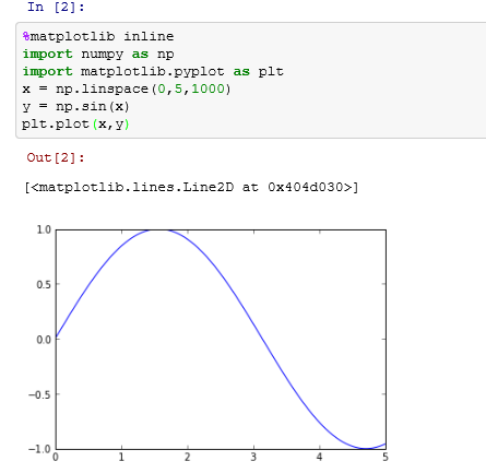
If you are using matplotlib, you might need to type this one:
matplotlib.rcParams['backend'] = 'QtAgg'
And restart the kernel. You will be able to see a graph appear if you type:
%matplotlib inline
import numpy as np
import matplotlib.pyplot as plt
x = np.linspace(0,5,1000)
y = np.sin(x)
plt.plot(x,y)
Use of d3.js in IPython notebook
After you opened a notebook using the command line ipython3 notebook mynotebook.ipynb, you can directly see the result of a javascript. You can directly copy/paste the following example into a notebook:
html_src = """
                <h2>Simple D3 plot</h2>
                <div id="chart"></div>
           """

test_d3_js = """
                    var width = 600;
                    var height = 100;
                    var root = d3.select('#chart').append('svg')
                        .attr({
                          'width': width,
                          'height': height,
                        })
                        .style('border', '1px solid black');

                    var evenNumbers = [0, 2, 4, 6, 8, 10];
                    var maxDataValue = d3.max(evenNumbers);
                    var barHeight = height / evenNumbers.length;
                    var barWidth = function(datum) {
                      return datum * (width / maxDataValue);
                    };
                    var barX = 0;
                    var barY = function(datum, index) {
                      return index * barHeight;
                    };
                    root.selectAll('rect.number')
                        .data(evenNumbers).enter()
                      .append('rect')
                        .attr({
                          'class': 'number',
                          'x': barX,
                          'y': barY,
                          'width': barWidth,
                          'height': barHeight,
                          'fill': '#A6D854',
                          'stroke': '#444',
                     });
             """

js_libs = ['http://rawgithub.com/mbostock/d3/master/d3.min.js']

import IPython
from IPython.core.display import display_html, display_javascript, Javascript
display_html(IPython.core.display.HTML(data=html_src))
display_javascript( Javascript(data=test_d3_js, lib= js_libs))
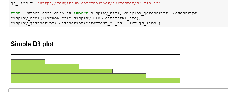
It works pretty well. Just be careful to change the div id when trying a new graph otherwise the new graph will be added to the previous one. However, the nice feature here is to be able to replay your graph and to reply the code to see your modifications. The notebook can take some time to install because it requires a couple of modules not easy to install with pip. The best way is maybe to install WinPython. It contains everything you need (Python, IPython, Notebook) and even more.
2015/05/08 nbconvert + javascript
Graphics with vincent
The module can be installed using pip install vincent and it works with IPython notebook. Once you started a new notebook, you need to type the following lines:
import vincent
vincent.core.initialize_notebook()
You can check everything is working fine by running the following examples:
list_data = [10, 20, 30, 20, 15, 30, 45]
import vincent
bar = vincent.Bar(list_data)
bar.display()  # each time you type this, the graph appears
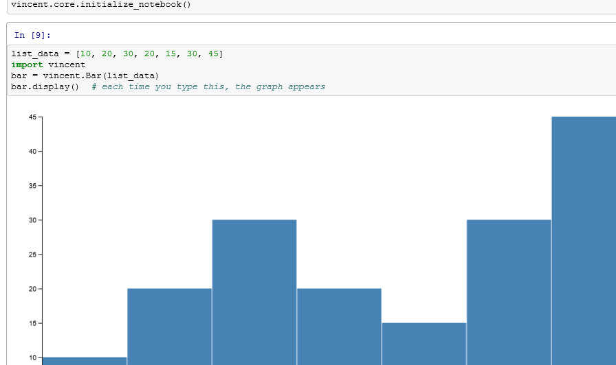
I did not find an easy way to store the graph into an image. The only export is done through json for vega (you cannot import yet). The parameter encoding does not seem to be implemented yet. It could be annoying for non English languages. Otherwise, it sounds nice.
d3.js with Python and d3py
This first module is very light. It does not seem to be developped anymore. However, it should not be too difficult to continue its implementation for your needs. It is easy to fork it on GitHub and to go on with your changes. This is a nexample of what you can do with it:
import d3py
import networkx as nx
G=nx.Graph()
G.add_edge(1,2)
G.add_edge(1,3)
G.add_edge(3,2)
G.add_edge(3,4)
G.add_edge(4,2)

with d3py.NetworkXFigure(G, name="graph",width=200, height=200) as p:
    p += d3py.ForceLayout()
    p.css['.node'] = {'fill': 'blue', 'stroke': 'magenta'}
    p.save_to_files()
    p.show()
Which gives (check the source this page):
One feature I like with this module is the possibility to easily test the result. The last instruction p.show() starts a python server (see below). You just have to copy paste the url to a browser to see the graph. Developping a graph means switching between your editor and your browser as follows:
<iframe frameborder="0" height="200" src="documents/graph_blog_20131130.html" width="500">
</iframe>
What you can see after type p.show():
You can find your chart at http://localhost:8000/graph.html
Ctrl-C to stop serving the chart and quit!
You should not run it with the notebook, you will have to restart the kernel or the following icon will stay for ever.

d3.js with Python, IPython and Python-nvd3
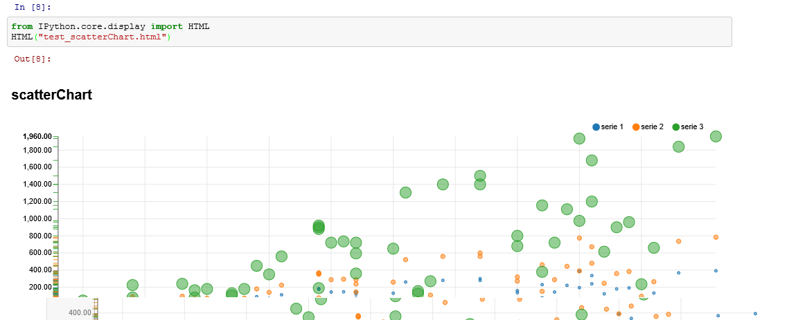
The module can be installed using pip install python-nvd3. It is based on d3.js and on nvd3 (github). It is very easy if you consider using IPython notebook. I made a quick tweak to be able to use scripts from github. You can install the module from python-nvd3.
from numpy import sin, pi, linspace
from nvd3 import lineChart, scatterChart
import random

type = "scatterChart"
# I modified the example at the end of the following line
chart = scatterChart(name=type, height=350, x_is_date=False, assets_directory="rawgithub")
chart.set_containerheader("\n\n<h2>" + type + "</h2>\n\n")
nb_element = 50
xdata = [i + random.randint(1, 10) for i in range(nb_element)]
ydata = [i * random.randint(1, 10) for i in range(nb_element)]
ydata2 = [x * 2 for x in ydata]
ydata3 = [x * 5 for x in ydata]

kwargs1 = {'shape': 'circle', 'size': '1'}
kwargs2 = {'shape': 'cross', 'size': '10'}
kwargs3 = {'shape': 'triangle-up', 'size': '100'}

extra_serie = {"tooltip": {"y_start": "", "y_end": " calls"}}
chart.add_serie(name="serie 1", y=ydata, x=xdata, extra=extra_serie, **kwargs1)
chart.add_serie(name="serie 2", y=ydata2, x=xdata, extra=extra_serie, **kwargs2)
chart.add_serie(name="serie 3", y=ydata3, x=xdata, extra=extra_serie, **kwargs3)

chart.buildhtml()
output_file = open('test_scatterChart.html', 'w')
output_file.write(chart.htmlcontent)
output_file.close()
And to display it using IPython notebook:
from IPython.core.display import HTML
HTML("test_scatterChart.html")
Something, IPython displays nothing on the first try because I assume the javascript takes time to load. After a short time (one minute), it perfectly works:
R with shiny
shiny is published by the same team which produces RStudio. It is nicely packaged and after all these pythonic short program, I must confess that it only took me a couple of minutes to make the example work.
You first need to install shiny (install.packages('shiny')). It is designed in a way you need to create two files you need to place in the same folder.
- ui.R
- server.R
library(shiny)

# Define UI for application that plots random distributions
shinyUI(pageWithSidebar(

  # Application title
  headerPanel("Hello Shiny!"),

  # Sidebar with a slider input for number of observations
  sidebarPanel(
    sliderInput("obs",
                "Number of observations:",
                min = 1,
                max = 1000,
                value = 500)
  ),

  # Show a plot of the generated distribution
  mainPanel(
    plotOutput("distPlot")
  )
))
And server.R:
library(shiny)

# Define server logic required to generate and plot a random distribution
shinyServer(function(input, output) {

  # Expression that generates a plot of the distribution. The expression
  # is wrapped in a call to renderPlot to indicate that:
  #
  #  1) It is "reactive" and therefore should be automatically
  #     re-executed when inputs change
  #  2) Its output type is a plot
  #
  output$distPlot <- renderPlot({

    # generate an rnorm distribution and plot it
    dist <- rnorm(input$obs)
    hist(dist)
  })
})
To see your graph, you need to type:
library(shiny)
runApp("<your_folder>")
The following page gallery contains some examples of what you can do with this library. However, it does not seem easy to convert this graph into HTML/Javascript. Shiny proposes to deploy a shiny application through a Shiny Server working on Linux. You do only R.
Alternatives
Another solution I recently found is MPLD3 which takes a matplotlib and cnoverts it into another graph using d3.js. You will find more on this page: Plotly, matplotlib, and mplexporter.
| <-- --> |
Xavier Dupré
|