1A.data - visualisation des données - correction#
Links: notebook, html, python, slides, GitHub
Correction.
%matplotlib inline
import matplotlib.pyplot as plt
from jyquickhelper import add_notebook_menu
add_notebook_menu()
Exercice 1 : écart entre les mariés#
On reprend d’abord le code qui permet de récupérer les données.
from urllib.error import URLError
import pyensae.datasource
from pyensae.datasource import dBase2df, DownloadDataException
files = ["etatcivil2012_nais2012_dbase.zip",
         "etatcivil2012_dec2012_dbase.zip",
         "etatcivil2012_mar2012_dbase.zip" ]

try:
    pyensae.datasource.download_data(files[-1],
                          website='http://telechargement.insee.fr/fichiersdetail/etatcivil2012/dbase/')
except (DownloadDataException, URLError, TimeoutError):
    # backup plan
    pyensae.datasource.download_data(files[-1], website="xd")

df = dBase2df("mar2012.dbf")
print(df.shape, df.columns)
df.head()
(246123, 16) Index(['ANAISH', 'DEPNAISH', 'INDNATH', 'ETAMATH', 'ANAISF', 'DEPNAISF',
       'INDNATF', 'ETAMATF', 'AMAR', 'MMAR', 'JSEMAINE', 'DEPMAR', 'DEPDOM',
       'TUDOM', 'TUCOM', 'NBENFCOM'],
      dtype='object')
| ANAISH | DEPNAISH | INDNATH | ETAMATH | ANAISF | DEPNAISF | INDNATF | ETAMATF | AMAR | MMAR | JSEMAINE | DEPMAR | DEPDOM | TUDOM | TUCOM | NBENFCOM | |
|---|---|---|---|---|---|---|---|---|---|---|---|---|---|---|---|---|
| 0 | 1982 | 75 | 1 | 1 | 1984 | 99 | 2 | 1 | 2012 | 01 | 1 | 29 | 99 | 9 | N | |
| 1 | 1956 | 69 | 2 | 4 | 1969 | 99 | 2 | 4 | 2012 | 01 | 3 | 75 | 99 | 9 | N | |
| 2 | 1982 | 99 | 2 | 1 | 1992 | 99 | 1 | 1 | 2012 | 01 | 5 | 34 | 99 | 9 | N | |
| 3 | 1985 | 99 | 2 | 1 | 1987 | 84 | 1 | 1 | 2012 | 01 | 4 | 13 | 99 | 9 | N | |
| 4 | 1968 | 99 | 2 | 1 | 1963 | 99 | 2 | 1 | 2012 | 01 | 6 | 26 | 99 | 9 | N |
Puis on effectue les opérations suggérées par l’énoncé.
df["ANAISH"] = df.apply (lambda r:  int(r["ANAISH"]), axis=1)
df["ANAISF"] = df.apply (lambda r:  int(r["ANAISF"]), axis=1)
df["differenceHF"] = df.ANAISH - df.ANAISF
df["nb"] = 1
dist = df[["nb","differenceHF"]].groupby("differenceHF", as_index=False).count()
import pandas
pandas.concat([dist.head(n=2), dist.tail(n=3)])
| differenceHF | nb | |
|---|---|---|
| 0 | -59 | 6 |
| 1 | -56 | 1 |
| 97 | 50 | 1 |
| 98 | 56 | 1 |
| 99 | 59 | 1 |
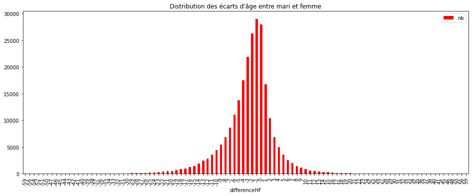
Exercice 2 : graphe de la distribution avec pandas#
L’exemple est suggéré par le paragraphe : bar plots.
ax = dist.plot(kind="bar", y="nb", x="differenceHF", figsize=(16,6), color="red")
ax.set_title("Distribution des écarts d'âge entre mari et femme");
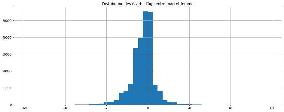
Mais on pouvait directement dessiner la distribution sans passer par un
group by comme suggérée par le paragraphe
histograms.
ax = df["differenceHF"].hist(figsize=(16,6), bins=50)
ax.set_title("Distribution des écarts d'âge entre mari et femme");
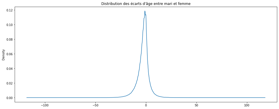
Ou encore la distribution lissée (voir density plot) (cela prend une minute environ) :
ax = df["differenceHF"].plot(figsize=(16,6), kind="kde")
ax.set_title("Distribution des écarts d'âge entre mari et femme");
Le second graphique peut être obtenu en écrivant :
df["ageH"] = -df.ANAISH + 2012
df["ageF"] = -df.ANAISF + 2012
df.plot(x="ageH", y="ageF", kind="scatter")
ax.set_title("Nuage de points - âge mari et femme");
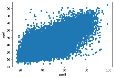
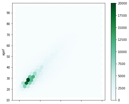
Il y a trop de points pour que cela soit lisible. C’est pourquoi, on utilise souvent une heatmap.
df.plot(kind='hexbin', x="ageH", y="ageF", gridsize=25, figsize=(7,6))
ax.set_title("Heatmap - âge entre mari et femmes");
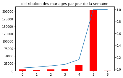
Exercice 3 : distribution des mariages par jour#
On veut obtenir un graphe qui contient l’histogramme de la distribution du nombre de mariages par jour de la semaine et d’ajouter une seconde courbe correspond avec un second axe à la répartition cumulée.
https://github.com/pydata/pandas/issues/11111
# ce code échoue pour pandas 0.17.rc1, prendre 0.16.2 ou 0.17.rc2
df["nb"] = 1
dissem = df[["JSEMAINE","nb"]].groupby("JSEMAINE",as_index=False).sum()
total = dissem["nb"].sum()
repsem = dissem.cumsum()
repsem["nb"] /= total

ax = dissem["nb"].plot(kind="bar", color="red")
repsem["nb"].plot(ax=ax, secondary_y=True)
ax.set_title("distribution des mariages par jour de la semaine");
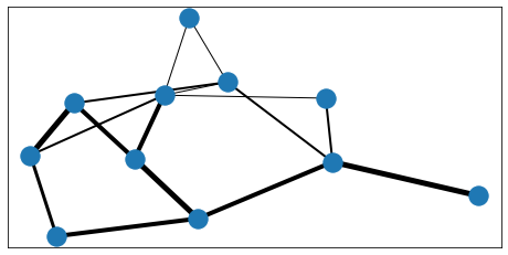
Exercice 4 : dessin d’un graphe avec networkx#
On construit un graphe aléatoire, ses 20 arcs sont obtenus en tirant 20 fois deux nombres entiers entre 1 et 10. Chaque arc doit avoir une épaisseur aléatoire.
import random
import networkx as nx
G=nx.Graph()
edge_width = [ ]
for i in range(20) :
    G.add_edge ( random.randint(0,10),  random.randint(0,10) )
    edge_width.append( random.randint( 1,5) )

import matplotlib.pyplot as plt
f, ax = plt.subplots(figsize=(8,4))

pos=nx.spring_layout(G)
nx.draw_networkx_nodes(G,pos)
nx.draw_networkx_edges(G,pos,width=edge_width,ax=ax);