module plotting.plotting_benchmark#
Short summary#
module mlprodict.plotting.plotting_benchmark
Useful plots.
Functions#
function |
truncated documentation |
|---|---|
Annotates a heatmap. See |
|
Creates a heatmap from a numpy array and two lists of labels. See |
|
Plots a heatmap which represents a benchmark. See example below. |
Documentation#
Useful plots.
- mlprodict.plotting.plotting_benchmark.annotate_heatmap(im, data=None, valfmt='{x:.2f}', textcolors=('black', 'black'), threshold=None, **textkw)#
Annotates a heatmap. See
plot_benchmark_metricsfor an example.- Parameters:
im – the AxesImage to be labeled.
data – data used to annotate. If None, the image’s data is used. Optional.
valfmt – the format of the annotations inside the heatmap. This should either use the string format method, e.g. “$ {x:.2f}”, or be a matplotlib.ticker.Formatter. Optional.
textcolors – a list or array of two color specifications. The first is used for values below a threshold, the second for those above. Optional.
threshold – value in data units according to which the colors from textcolors are applied. If None (the default) uses the middle of the colormap as separation. Optional.
textkw – all other arguments are forwarded to each call to text used to create the text labels.
- Returns:
annotated objects
- mlprodict.plotting.plotting_benchmark.heatmap(data, row_labels, col_labels, ax=None, cbar_kw=None, cbarlabel=None, **kwargs)#
Creates a heatmap from a numpy array and two lists of labels. See
plot_benchmark_metricsfor an example.- Parameters:
data – a 2D numpy array of shape (N, M).
row_labels – a list or array of length N with the labels for the rows.
col_labels – a list or array of length M with the labels for the columns.
ax – a matplotlib.axes.Axes instance to which the heatmap is plotted, if not provided, use current axes or create a new one. Optional.
cbar_kw – a dictionary with arguments to matplotlib.Figure.colorbar. Optional.
cbarlabel – the label for the colorbar. Optional.
kwargs – all other arguments are forwarded to imshow
- Returns:
ax, image, color bar
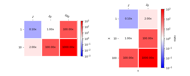
- mlprodict.plotting.plotting_benchmark.plot_benchmark_metrics(metric, xlabel=None, ylabel=None, middle=1.0, transpose=False, ax=None, cbar_kw=None, cbarlabel=None, valfmt='{x:.2f}x')#
Plots a heatmap which represents a benchmark. See example below.
- Parameters:
metric – dictionary
{ (x,y): value }xlabel – x label
ylabel – y label
middle – force the white color to be this value
transpose – switches x and y
ax – axis to borrow
cbar_kw –
a dictionary with arguments to matplotlib.Figure.colorbar. Optional.
cbarlabel – the label for the colorbar. Optional.
valfmt – format for the annotations
- Returns:
ax, colorbar
Plot benchmark improvments
import matplotlib.pyplot as plt
from mlprodict.plotting.plotting_benchmark import plot_benchmark_metrics

data = {(1, 1): 0.1, (10, 1): 1, (1, 10): 2,
        (10, 10): 100, (100, 1): 100, (100, 10): 1000}

fig, ax = plt.subplots(1, 2, figsize=(10, 4))
plot_benchmark_metrics(data, ax=ax[0], cbar_kw={'shrink': 0.6})
plot_benchmark_metrics(data, ax=ax[1], transpose=True,
                       xlabel='X', ylabel='Y',
                       cbarlabel="ratio")
plt.show()